6 Visualization/ggplot2
One reason ggplot2 is generally more intuitive for beginners is that it uses a grammar of graphics, the gg in ggplot2. This is analogous to the way learning grammar can help a beginner construct hundreds of different sentences by learning just a handful of verbs, nouns and adjectives without having to memorize each specific sentence. 
One limitation is that ggplot2 is designed to work exclusively with data tables in tidy format (where rows are observations and columns are variables). However, a substantial percentage of datasets that beginners work with are in, or can be converted into, this format. An advantage of this approach is that, assuming that our data is tidy, ggplot2 simplifies plotting code and the learning of grammar for a variety of plots.
The first step in learning ggplot2 is to be able to break a graph apart into components. Let’s break down the murders in the US plot and introduce some of the ggplot2 terminology. The main three components to note are:
Data: The US murders data table is being summarized. We refer to this as the data component.
Geometry: The plot is a scatterplot. This is referred to as the geometry component. Other possible geometries are barplot, histogram, smooth densities, qqplot, and boxplot.
Aesthetic mapping: The plot uses several visual cues to represent the information provided by the dataset. The two most important cues in this plot are the point positions on the x-axis and y-axis, which represent population size and the total number of murders, respectively. Each point represents a different observation, and we map data about these observations to visual cues like x- and y-scale. Color is another visual cue that we map to region. We refer to this as the aesthetic mapping component. How we define the mapping depends on what geometry we are using.
6.1 gg object
ggplot() initializes a ggplot object. It can be used to declare the input data frame for a graphic and to specify the set of plot aesthetics intended to be common throughout all subsequent layers unless specifically overridden.
ggplot(data = murders)We can also pipe the data in as the first argument. So this line of code is equivalent to the one above:
murders %>% ggplot()6.2 Aesthetics
Aesthetic mappings describe how properties of the data connect with features of the graph, such as distance along an axis, size, or color. The aes function connects data with what we see on the graph by defining aesthetic mappings and will be one of the functions you use most often when plotting. The outcome of the aes function is often used as the argument of a geometry function. This example produces a scatterplot of total murders versus population in millions:
murders %>% ggplot() +
  geom_point(aes(x = population / 10^6, y = total))
We can drop the x = and y = if we wanted to since these are the first and second expected arguments, as seen in the help page.
Instead of defining our plot from scratch, we can also add a layer to the p object that was defined above as p <- ggplot(data = murders):
p + geom_point(aes(population / 10^6, total))The scale and labels are defined by default when adding this layer. Like dplyr functions, aes also uses the variable names from the object component: we can use population and total without having to call them as murders$population and murders$total. The behavior of recognizing the variables from the data component is quite specific to aes. With most functions, if you try to access the values of population or total outside of aes you receive an error.
colour and fill
Almost every geom has either colour, fill, or both. They can be specified in the following ways: * A name, e.g., “red.” R has 657 built-in named colours, which can be listed with colours(). * An rgb specification, with a string of the form “#RRGGBB” where each of the pairs RR, GG, BB consists of two hexadecimal digits giving a value in the range 00 to FF * You can optionally make the colour transparent by using the form “#RRGGBBAA.” * An NA, for a completely transparent colour. * The munsell package, by Charlotte Wickham, makes it easy to choose specific colours using a system designed by Albert H. Munsell. If you invest a little in learning the system, it provides a convenient way of specifying aesthetically pleasing colours.
lines
As well as colour, the appearance of a line is affected by size, linetype, linejoin and lineend.
Line type
https://ggplot2.tidyverse.org/articles/ggplot2-specs.html#sec:line-type-spec
Line types can be specified with an integer or name: 0 = blank, 1 = solid, 2 = dashed, 3 = dotted, 4 = dotdash, 5 = longdash, 6 = twodash, as shown below:
Size
The size of a line is its width in mm.
Line end/join paramters
https://ggplot2.tidyverse.org/articles/ggplot2-specs.html#line-endjoin-paramters.
- The appearance of the line end is controlled by the
lineendparamter, and can be one of “round,” “butt” (the default), or “square.” - The appearance of line joins is controlled by linejoin and can be one of “round” (the default), “mitre,” or “bevel.”
- Mitre joins are automatically converted to bevel joins whenever the angle is too small (which would create a very long bevel). This is controlled by the linemitre parameter which specifies the maximum ratio between the line width and the length of the mitre.
Polygons
The border of the polygon is controlled by the colour, linetype, and size aesthetics as described above. The inside is controlled by fill.
Point
Shape
https://ggplot2.tidyverse.org/articles/ggplot2-specs.html#sec:shape-spec
Shapes take five types of values: * An integer in \[0:25\] * The name of the shape: “circle,” “dot,” “square,” “square filled”… * A single character, to use that character as a plotting symbol. * A . to draw the smallest rectangle that is visible, usualy 1 pixel. * An NA, to draw nothing.
Colour and fill
https://ggplot2.tidyverse.org/articles/ggplot2-specs.html#colour-and-fill-1
Note that shapes 21-24 have both stroke colour and a fill. The size of the filled part is controlled by size, the size of the stroke is controlled by stroke. Each is measured in mm, and the total size of the point is the sum of the two. Note that the size is constant along the diagonal in the following figure.
Text
Font face
https://ggplot2.tidyverse.org/articles/ggplot2-specs.html#font-face
There are only three fonts that are guaranteed to work everywhere: “sans” (the default), “serif,” or “mono.” It’s trickier to include a system font on a plot because text drawing is done differently by each graphics device (GD). There are five GDs in common use (png(), pdf(), on screen devices for Windows, Mac and Linux), so to have a font work everywhere you need to configure five devices in five different ways. Two packages simplify the quandary a bit:
- showtext makes GD-independent plots by rendering all text as polygons.
- extrafont converts fonts to a standard format that all devices can use.
Both approaches have pros and cons, so you will to need to try both of them and see which works best for your needs.
Font size
The size of text is measured in mm. This is unusual, but makes the size of text consistent with the size of lines and points. Typically you specify font size using points (or pt for short), where 1 pt = 0.35mm. ggplot2 provides this conversion factor in the variable .pt, so if you want to draw 12pt text, set size = 12 / .pt.
6.3 Geometries
In ggplot2 we create graphs by adding layers. Layers can define geometries, compute summary statistics, define what scales to use, or even change styles. To add layers, we use the symbol +. In general, a line of code will look like this:
# DATA %>% ggplot() + LAYER 1 + LAYER 2 + … + LAYER N6.3.1 Points
starwars %>%
  ggplot(aes(mass, height, color = sex)) +
  geom_point() +
  scale_x_continuous(trans = "log10") +
  scale_y_continuous(trans = "log10")
## Warning: Removed 28 rows containing missing values (geom_point).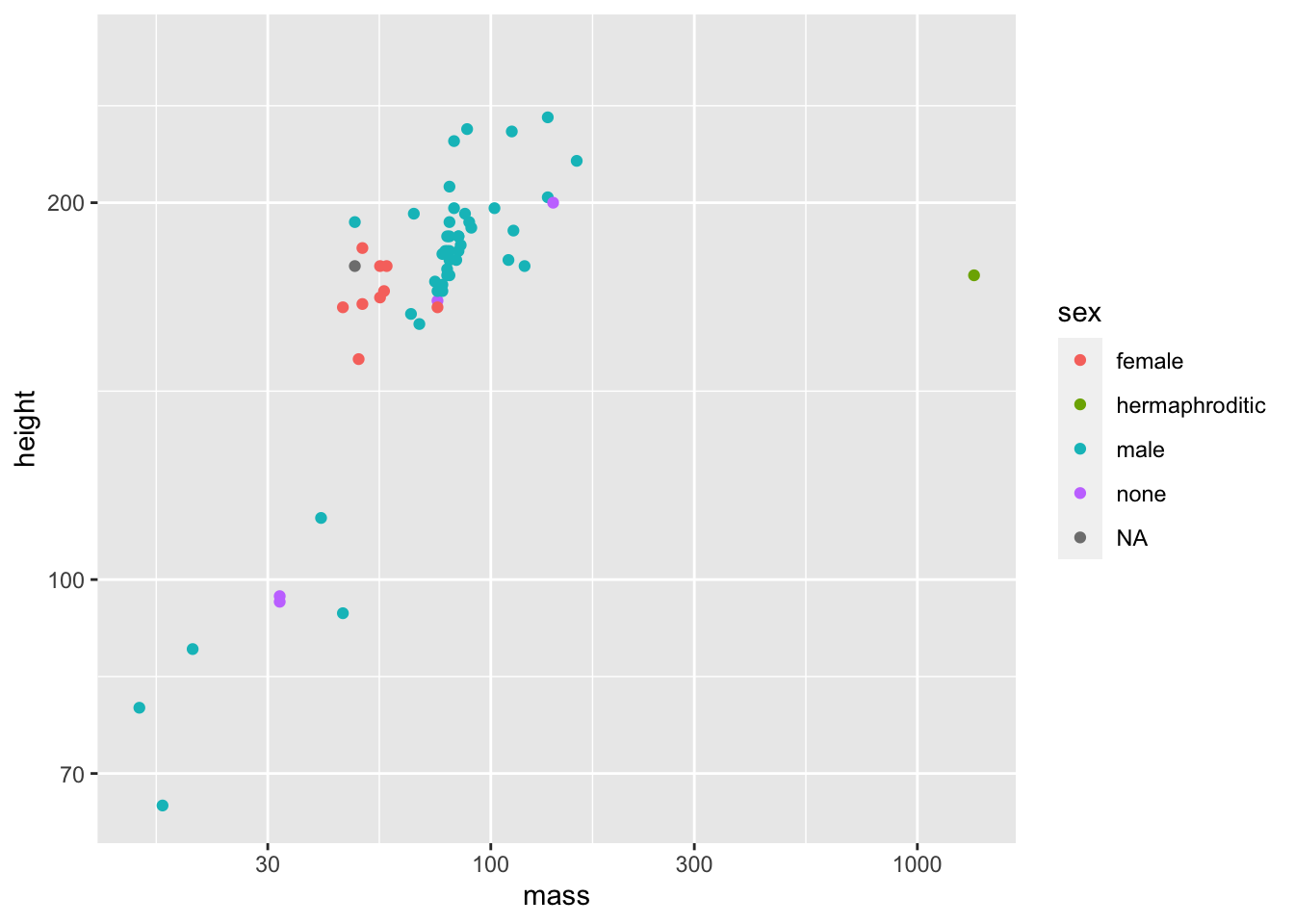
The point geom is used to create scatterplots. The scatterplot is most useful for displaying the relationship between two continuous variables. It can be used to compare one continuous and one categorical variable, or two categorical variables, but a variation like geom_jitter(), geom_count(), or geom_bin2d() is usually more appropriate. A bubblechart is a scatterplot with a third variable mapped to the size of points.
starwars %>%
  ggplot(aes(sex, height)) +
  geom_point()
## Warning: Removed 6 rows containing missing values (geom_point).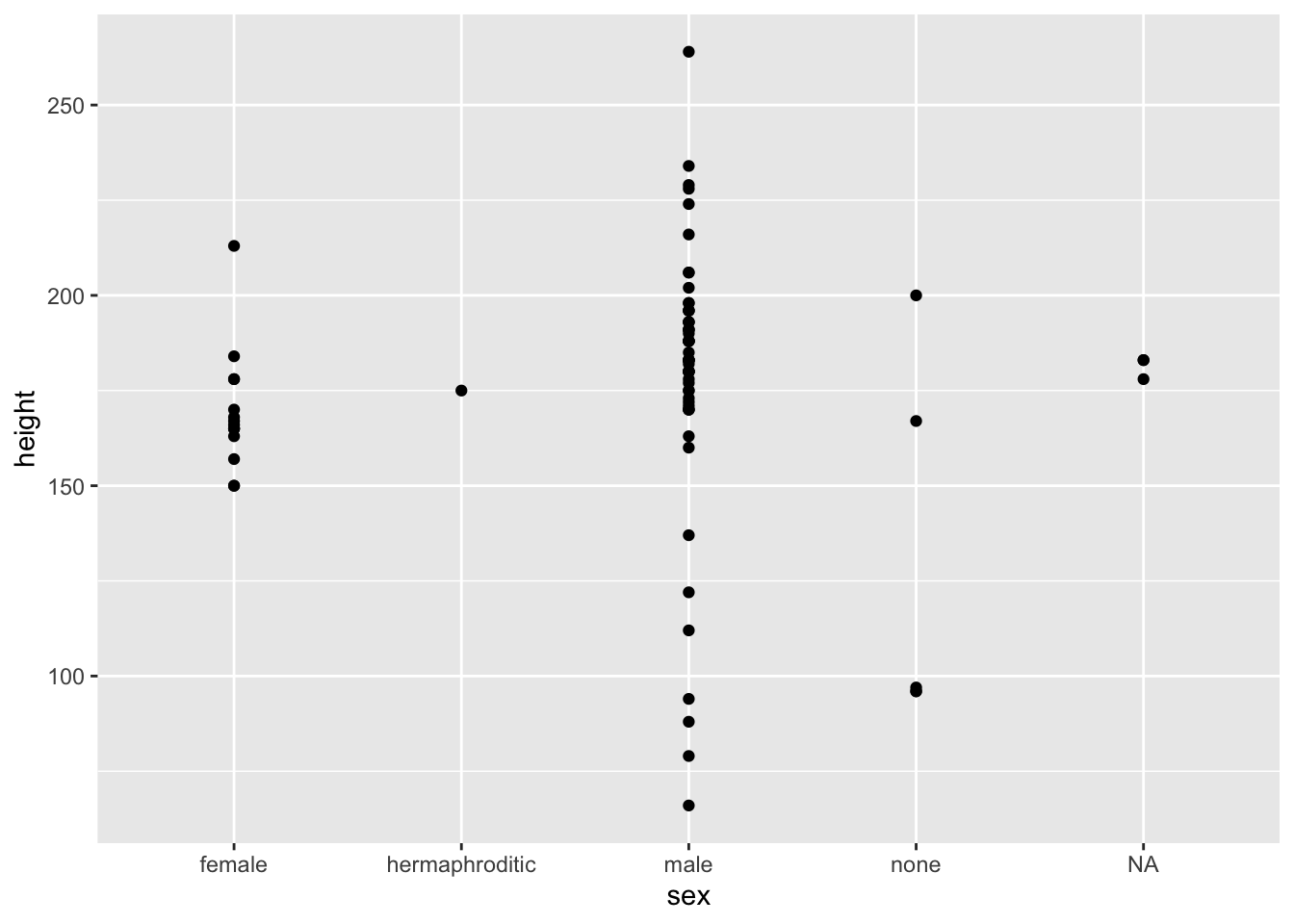
starwars %>%
  ggplot(aes(sex, height, color = sex)) +
  geom_jitter(show.legend = NA) +
  theme(legend.position="none")
## Warning: Removed 6 rows containing missing values (geom_point).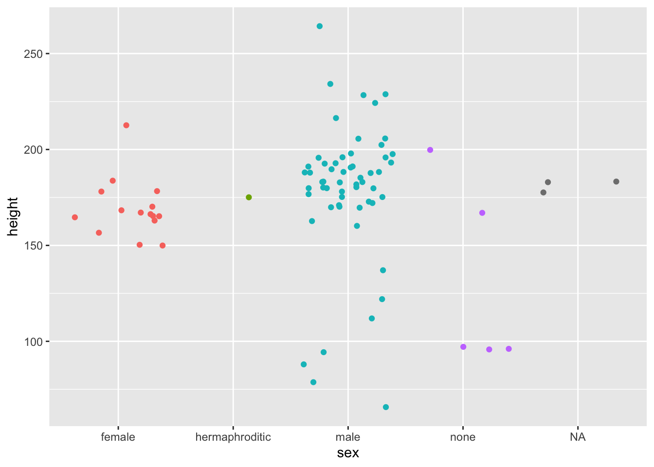
Arguments
geom_point(
  mapping = NULL,
  data = NULL,
  stat = "identity",
  position = "identity",
  ...,
  na.rm = FALSE,
  show.legend = NA,
  inherit.aes = TRUE
)
Aesthetics
geom_point() understands the following aesthetics (required aesthetics are in bold): * x ! * y ! * alpha * colour * fill * group * shape * size * stroke
Overplotting
The biggest potential problem with a scatterplot is overplotting: whenever you have more than a few points, points may be plotted on top of one another. This can severely distort the visual appearance of the plot. There is no one solution to this problem, but there are some techniques that can help.
- You can add additional information with geom_smooth(), geom_quantile() or geom_density_2d(). If you have few unique x values, geom_boxplot() may also be useful.
- Alternatively, you can summarise the number of points at each location and display that in some way, using geom_count(), geom_hex(), or geom_density2d().
- Another technique is to make the points transparent (e.g. geom_point(alpha = 0.05)) or very small (e.g. geom_point(shape = “.”)).
Examples
https://ggplot2.tidyverse.org/reference/geom\_point.html#examples
6.3.2 Text
https://ggplot2.tidyverse.org/reference/geom_text.html
mtcars %>%
  ggplot() +
  aes(wt, mpg, label = rownames(mtcars)) + # labels can be accessed via rownames.
  geom_text(check_overlap = T) # text data points often overlap, so turn on check_overlap.
Test Geom
Text geoms are useful for labeling plots. They can be used by themselves as scatterplots or in combination with other geoms, for example, for labeling points or for annotating the height of bars. geom_text() adds only text to the plot. geom_label() draws a rectangle behind the text, making it easier to read.
Arguments
geom_text(
  mapping = NULL,
  data = NULL,
  stat = "identity",
  position = "identity",
  ...,
  parse = FALSE,
  nudge_x = 0, # Nudge each point to left or right.
  nudge_y = 0, # Nudge each point to top or bottom.
  check_overlap = FALSE, # If TRUE, text that overlaps previous text in the same layer will not be plotted
  na.rm = FALSE,
  show.legend = NA,
  inherit.aes = TRUE
)

geom_label(
  mapping = NULL,
  data = NULL,
  stat = "identity",
  position = "identity",
  ...,
  parse = FALSE,
  nudge_x = 0, # Nudge each point to left or right.
  nudge_y = 0, # Nudge each point to top or bottom.
  label.padding = unit(0.25, "lines"), # Amount of padding around label.
  label.r = unit(0.15, "lines"), # Radius of rounded corners.
  label.size = 0.25, # Size of label border.
  na.rm = FALSE,
  show.legend = NA,
  inherit.aes = TRUE
)
Aesthetics
geom_text() understands the following aesthetics (required aesthetics are in bold): * x ! * y ! * label ! * alpha * angle * colour * family * fontface * group * hjust * lineheight * size * vjust
Alignment
You can modify text alignment with the vjust and hjust aesthetics. These can either be a number between 0 (right/bottom) and 1 (top/left) or a character (“left,” “middle,” “right,” “bottom,” “center,” “top”). There are two special alignments: “inward” and “outward.” Inward always aligns text towards the center, and outward aligns it away from the center.
Examples
https://ggplot2.tidyverse.org/reference/geom\_text.html#examples
6.3.3 Bars
mpg %>%
  ggplot() +
  aes(class) +
  geom_bar()
Bar Geom
There are two types of bar charts: geom_bar() and geom_col(). geom_bar() makes the height of the bar proportional to the number of cases in each group (or if the weight aesthetic is supplied, the sum of the weights). If you want the heights of the bars to represent values in the data, use geom_col() instead. geom_bar() uses stat_count() by default: it counts the number of cases at each x position. geom_col() uses stat_identity(): it leaves the data as is.
geom_bar(
  mapping = NULL,
  data = NULL,
  stat = "count",
  position = "stack",
  ...,
  width = NULL,
  na.rm = FALSE,
  orientation = NA,
  show.legend = NA,
  inherit.aes = TRUE
)

geom_col(
  mapping = NULL,
  data = NULL,
  position = "stack",
  ...,
  width = NULL,
  na.rm = FALSE,
  show.legend = NA,
  inherit.aes = TRUE
)

stat_count(
  mapping = NULL,
  data = NULL,
  geom = "bar",
  position = "stack",
  ...,
  width = NULL,
  na.rm = FALSE,
  orientation = NA,
  show.legend = NA,
  inherit.aes = TRUE
)
Details
A bar chart uses height to represent a value, and so the base of the bar must always be shown to produce a valid visual comparison. Proceed with caution when using transformed scales with a bar chart. It’s important to always use a meaningful reference point for the base of the bar. For example, for log transformations the reference point is 1. In fact, when using a log scale, geom_bar() automatically places the base of the bar at 1. Furthermore, never use stacked bars with a transformed scale, because scaling happens before stacking. As a consequence, the height of bars will be wrong when stacking occurs with a transformed scale.
By default, multiple bars occupying the same x position will be stacked atop one another by position_stack(). If you want them to be dodged side-to-side, use position_dodge() or position_dodge2(). Finally, position_fill() shows relative proportions at each x by stacking the bars and then standardising each bar to have the same height.
Orientation
This geom treats each axis differently and, thus, can thus have two orientations. Often the orientation is easy to deduce from a combination of the given mappings and the types of positional scales in use. Thus, ggplot2 will by default try to guess which orientation the layer should have. Under rare circumstances, the orientation is ambiguous and guessing may fail. In that case the orientation can be specified directly using the orientation parameter, which can be either “x” or “y.” The value gives the axis that the geom should run along, “x” being the default orientation you would expect for the geom.
Aesthetics
geom_bar() understands the following aesthetics (required aesthetics are in bold):
- x or y !
- alpha
- colour
- fill
- group
- linetype
- size
geom_col() understands the following aesthetics (required aesthetics are in bold):
- x or y !
- alpha
- colour
- fill
- group
- linetype
- size
stat_count() understands the following aesthetics (required aesthetics are in bold):
- x or y !
- group
- weight
Computed variables
- count: number of points in bin
- prop: groupwise proportion
We often already have a table with a distribution that we want to present as a barplot. Here is an example of such a table:
data(murders)
tab <- murders %>%
  count(region) %>%
  mutate(proportion = n/sum(n))
tab
# >          region  n proportion
# > 1     Northeast  9      0.176
# > 2         South 17      0.333
# > 3 North Central 12      0.235
# > 4          West 13      0.255
We no longer want geombar to count, but rather just plot a bar to the height provided by the proportion variable. For this we need to provide x (the categories) and y (the values) and use the stat=“identity” option.
tab %>% ggplot(aes(region, proportion)) + geom_bar(stat = "identity")6.3.4 Density
diamonds %>%
  ggplot(aes(carat)) +
geom_density() 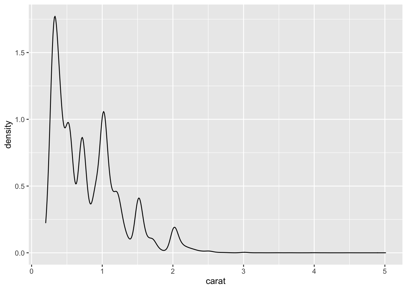
Computes and draws kernel density estimate, which is a smoothed version of the histogram. This is a useful alternative to the histogram for continuous data that comes from an underlying smooth distribution.
geom_density(
  mapping = NULL,
  data = NULL,
  stat = "density",
  position = "identity",
  ...,
  na.rm = FALSE,
  orientation = NA,
  show.legend = NA,
  inherit.aes = TRUE,
  outline.type = "upper"
)

stat_density(
  mapping = NULL,
  data = NULL,
  geom = "area",
  position = "stack",
  ...,
  bw = "nrd0",
  adjust = 1,
  kernel = "gaussian",
  n = 512,
  trim = FALSE,
  na.rm = FALSE,
  orientation = NA,
  show.legend = NA,
  inherit.aes = TRUE
)
6.3.5 Boxplots
heights_metric %>%
  ggplot(aes(sex,height)) +
  geom_boxplot()
When using a geom_jitter and you don’t want to double plot outliers, you can hide the geom_boxplots outliers by setting outlier.shape to NA.
heights_metric %>%
  ggplot(aes(sex,height)) +
  geom_boxplot(outlier.shape = NA) +
geom_jitter(alpha = 0.25, width = 0.25)6.3.7 Vertical Lines
This adds a vertical line with an x intercept of 1963 and a blue color for visual effects.
geom_vline(xintercept=1963, col = "blue") 6.4 Coordinates
6.4.1 Limits
Limit the scale like this:
coord_cartesian(xlim = c(70,85))6.4.2 Flipping
Flips the coordinate system, so that x and y are switched.
coord_flip()

geom_bar() + coord_flip()
6.5 Tiles
6.6 Scales
6.6.1 Logarithmic scales
This is an axis which plots values on an exponantially “growing” line and is great for highly skewed distributions. Here is a video to freshen up on log scales:
https://www.youtube.com/watch?v=sBhEi4L91Sg
First, our desired scales are in log-scale. This is not the default, so this change needs to be added through a scales layer. A quick look at the cheat sheet reveals the scale_x_continuous function lets us control the behavior of scales. We use them like this:
p + geom_point(size = 3) +
  geom_text(nudge_x = 0.05) +
  scale_x_continuous(trans = "log10") +
  scale_y_continuous(trans = "log10")
Because we are in the log-scale now, the nudge must be made smaller. This particular transformation is so common that ggplot2 provides the specialized functions scale_x_log10 and scale_y_log10, which we can use to rewrite the code like this:
p + geom_point(size = 3) +
  geom_text(nudge_x = 0.05) +
  scale_x_log10() +
  scale_y_log10()
6.6.2 Scale label format
Change scale label formats like this:
scale_x_continuous(labels = scales::comma)Change numeric year scale brakes:
scale_x_continuous(breaks = seq(1960, 2020, by = 10))- Link for axis formatting: Axis Formatting
6.7 Labels
Good labels are critical for making your plots accessible to a wider audience. Always ensure the axis and legend labels display the full variable name. Use the plot title and subtitle to explain the main findings. It’s common to use the caption to provide information about the data source. tag can be used for adding identification tags to differentiate between multiple plots.
# Simple description:
ggtitle(label, subtitle = waiver())

xlab(label)

ylab(label)

# More informative description:
labs(
  ...,
  title = waiver(),
  subtitle = waiver(),
  caption = waiver(),
  tag = waiver(),
  alt = waiver(),
  alt_insight = waiver()
)
Details
You can also set axis and legend labels in the individual scales (using the first argument, the name). If you’re changing other scale options, this is recommended.
If a plot already has a title, subtitle, caption, etc., and you want to remove it, you can do so by setting the respective argument to NULL. For example, if plot p has a subtitle, then p + labs(subtitle = NULL) will remove the subtitle from the plot.
- Change color or size legend label:
labs(color = "Country", size = "GDP")